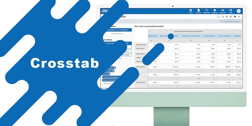
Crosstabs (or Crosstab tables) are one of the most powerful tools for data analysis in surveys and market research. Also known as contingency tables, Crosstabs allow researchers to analyze the relationship between two or more categorical variables, making it easier to identify trends and correlations.
In detail, a crosstab table (or contingency table) is a matrix showing the frequency distribution of two or more variables with at least one categorical variable. Each cell in the cross column and row (Banner and Stubs) shows the number of observations that fall into that combination or the frequency expressed as a percentage.
For example, by crossing the variables age group and educational qualification, we could observe how many people in the sample in the 30-49 age group had a bachelor’s degree.
Crosstabs example:

Depending on the instrument used we activate the option to run the Pairwise Z-Test, a classic statistical test to highlight or test for correlation between multiple categorical variables.
How to interpret the test results of the crosstabs?
In the example below we see that in the Compulsory Schools column, on the Few row, the letters B and C are shown in the crosstab table. This means that for those with an education degree of compulsory schools, the likelihood that they would report spending little time on social is significantly higher than those with an education degree of “High School” (B) or a degree of “University” (C). Thus, in this example, a correlation emerges between education degree and self-reported time.

Interpreting Crosstabs: Chi-Square and P-Value
To simplify the previous example we skipped the Chi-square statistical significance test. With this preliminary test we can check whether the sample size and the results obtained can give us results attributable to chance or to a correlation between the variables. Depending on the confidence level of the research, generally set at 95% or 99%, we need to verify that the p-value resulting from the Chi-square test is less than 0.05 (95% confidence level) or 0.01 (99% confidence level), respectively.
For example, if the p-value is greater than 0.05, it means that the difference between the categories can be given by chance with a probability greater than 5%, thus greater than what is predetermined by the research. On the other hand, if the p-value is less than 0.05, the probability that the difference between categories is determined by chance is within the margin of tolerance of the research. Only in this case could we consider the initial hypothesis “level of education is correlated with frequency of social media use” to be true.
In our example we have a p-value well above 0.05 and therefore the hypothesis cannot be confirmed.

When to use crosstabs?
Crosstabs are useful in several contexts, especially when you want to:
- Compare subgroups: analyze how different categories (e.g., age, gender, geographic area) influence answers or behaviors.
- Detect hidden patterns: discover significant correlations or differences between variables or categories of variables.
- Simplify complex data: represent large data sets in an understandable and visual way.
- Perform inferential analysis: evaluate statistical association between variables through tests such as Chi-Square, Z-test or Anova.
Examples of practical use of crosstab tables:
- Market research: understand whether purchase preferences are correlated with gender or age group.
- Political surveys: analyze the correlation between voting intention and region of residence.
- Customer satisfaction: see if customer satisfaction is related to the product or service purchased.
Using Crosstabs for data analysis
To get the most out of crosstabs for your data analysis, it is essential to follow some best practices that will make the data clearer, more readable, and more meaningful. The first step is to choose the variables to be analyzed carefully, favoring those that might show a significant relationship. Selecting irrelevant or overly general variables could make the table unhelpful or even misleading, preventing interesting patterns from being detected.
Another crucial aspect is the clarity of the crosstab table. It is important to limit the number of categories to prevent the representation from becoming too complex and difficult to interpret. An overly dense table risks confusing rather than clarifying the data. To facilitate reading of crosstabs, it is essential to consider absolute frequencies, that is, the number of answers or observations in each cell. However, absolute numbers alone may not be sufficient to identify significant trends or differences between groups. For this reason, it is useful to include row or column percentages, which make it possible to normalize the data and easily compare categories with each other. For example, if in a survey 60 percent of male respondents preferred a particular product compared to 40 percent of female respondents, this information becomes much clearer expressed in percentage terms rather than simple absolute numbers. In addition to this, row and column totals provide the overall picture of the observations, helping to understand the weight of each subgroup relative to the total analysis.
Another essential step in the interpretation of crosstabs is to check the statistical significance of the results. This can be done, as seen in the previous example, by using statistical tests such as the Chi-Square, determining whether the observed differences between categories are statistically significant or simply the result of chance. This step is crucial to ensure that the conclusions drawn from the analysis have a sound basis.
When to use Crosstabs in research? Pros and cons
PROS
Simplicity: they are easy to construct and interpret.
Clarity: present complex data in an immediate visual format.
Flexibility: they can be used in various contexts and sectors.
Advanced analysis tools: enable statistical tests to validate observations.
CONS
Complexity reduction: they represent only part of the dataset and may oversimplify complex relationships.
Problems with continuous variables: work best with categorical variables and require grouping of numeric variables.
Information overload: if too many categories are used, tables can become difficult to read.
What key features should a good tool have for Crosstabs analysis
The essential features for analysis with Crosstabs are:
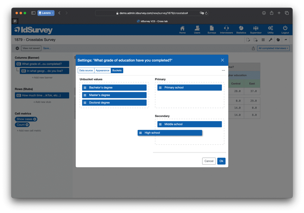
Bucket: it allows the creation of baskets i.e., groupings of several categories of a variable. For example, grouping the many regions of a nation into a few areas (north, center, south) in order to facilitate the interpretation and reading of data.
This feature can also be used to create categories of continuous variables, that is, to divide numerical data into specific ranges to simplify their analysis and understanding. For example, one can group respondents’ ages into ranges, such as 18-25 years, 26-35 years, 36-50 years, and over 50, instead of analyzing each age separately. This approach makes it possible to highlight general trends and make data interpretation clearer, avoiding excessive fragmentation of information.
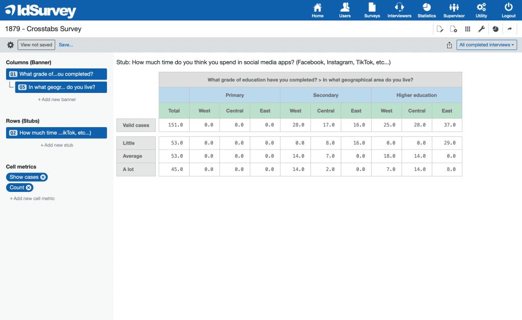
Nested variables: this feature allows the Banner (columns) to be structured hierarchically, nesting two or more variables within a single cross table. Each category of the first variable is further subdivided according to the categories of the second variable, and so on, creating a more detailed and layered analysis.
For example, one can analyze the variable Degree of Education by breaking it down by geographic areas of a nation. In this way, instead of seeing the levels of education aggregated for the whole country, one can see how they are distributed within each geographical area (North, Central, South).
Statistical tests: in order to ensure a thorough and reliable analysis, it is essential that the instrument used offers the possibility of performing several statistical tests, including Chi-Square, Z-Test and ANOVA. These tests allow us to test whether the observed relationships between variables are truly significant or simply due to chance, providing a stronger basis for interpreting the data.
ANOVA (Analysis of Variance), which we have not discussed in this article, is particularly important when one wants to compare the mean of a numerical (continuous) variable among several distinct groups defined by a categorical variable. For example, it can be used to analyze whether satisfaction with a service varies by age group or whether average income differs among different geographic regions. Using ANOVA, it is possible to determine whether statistically significant differences exist between groups and, if so, to investigate which groups differ the most.
Other statistical metrics: for a complete and thorough analysis, it is essential that the instrument used provide a wide range of descriptive statistics, including mean, median, variance, and standard deviation. These indicators allow for a better understanding of the distribution of the data and to identify significant patterns that may not emerge from a simple reading of frequencies.
Management of multiple stubs: to conduct an in-depth analysis of survey data, it may be necessary to create contingency tables for multiple variables. The ideal tool should offer a streamlined approach, allowing users to set up multiple variable rows (stubs) to compare against the same banner and seamlessly switch between them while preserving metric settings.
Smart and Automatic Saving: modern tools efficiently manage automatic saving, a crucial feature when working with multiple crosstabs, as it ensures a more flexible and dynamic workflow. In contrast, outdated software requires frequent manual saves to external files, preset configurations for settings and metrics, and manual dataset imports—significantly slowing down the workflow and reducing efficiency in data analysis.
Advanced Crosstabs Export to Excel: most software allows exporting contingency tables in Excel format, but only a few provide clear and well-structured formatting within the file. Additionally, only the most advanced tools support simultaneous export of multiple crosstabs, generating an Excel file with multiple sheets, each containing a virtually unlimited number of crosstab tables. These tools enable users to export a complete analysis in a single file, streamlining data management and organization.
Conclusions
Crosstabs are a powerful and versatile tool in data analysis, essential for researchers, analysts, and anyone who needs to gain insight from a survey or complex dataset. When used correctly, they uncover meaningful relationships and facilitate strategic decisions based on hard data.